
A Reimagining of
Instagram’s Shop
Duration:
2 Weeks
Team:
Ariel Jiménez
Dalena Le
Shannon O’Gorman
Valeriia Koltsova
My Role:
UX Researcher & Designer
Methods:
Competitive/Comparative Analysis
Affinity Mapping
Information Architecture
Rapid Sketching
Wireframing & Prototyping
Tools:
Figma
Project Background
This project centered around the app, Instagram, which is a photo and video sharing social networking service. Instagram wanted to increase user engagement in their Shop page. With this in mind, the project team decided to look for ways to make any improvements and also add a Shop section on Instagram’s website so it would not be limited to just the mobile app. Our team split roles so that each individual would have an opportunity to lead a portion of the research or design phases based on our strengths.

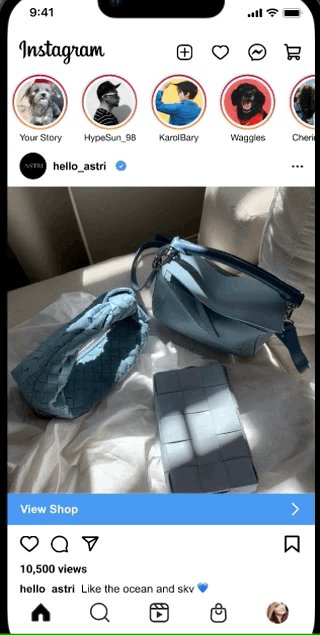
Instagram’s Current Shop Page

One way that Instagram advertises a product on the Home Page.
Assessing the Problem
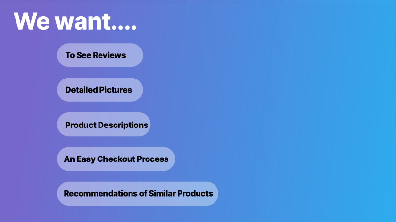
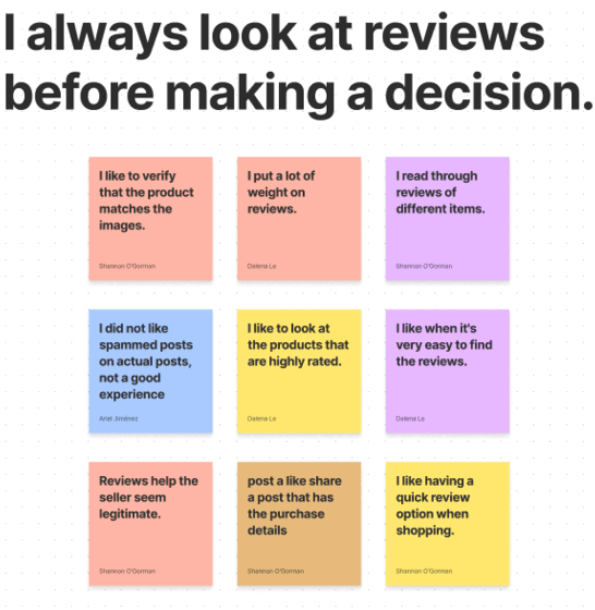
From our 5 interviews, we noticed the most common trend was that no one really knew that Instagram had a Shop section nor was it something that was thought about because Instagram is not known as an e-commerce app. Even though the Shop icon is located within the bottom navigation, it did not seem to matter because 100% of the users clicked on the Explore page icon.
Interview Insights:
Users like having ways to know if a non-verified seller is legitimate.
Users like having an easy method of communication with the seller.
“I put a lot of weight on reviews.”
An e-commerce site is more reliable than a social media platform for buying things.
Users Said:
Competitive/Comparative Analysis
Following the interviews, I focused on providing a detailed analysis comparing key features within Instagram’s Shop vs. other potential competitors. Outside of Instagram, both the mobile app and desktop versions of each competitor were checked for similarities and differences. Larger scale e-commerce sites were analyzed on the chance that they might influence any improvements for Instagram.
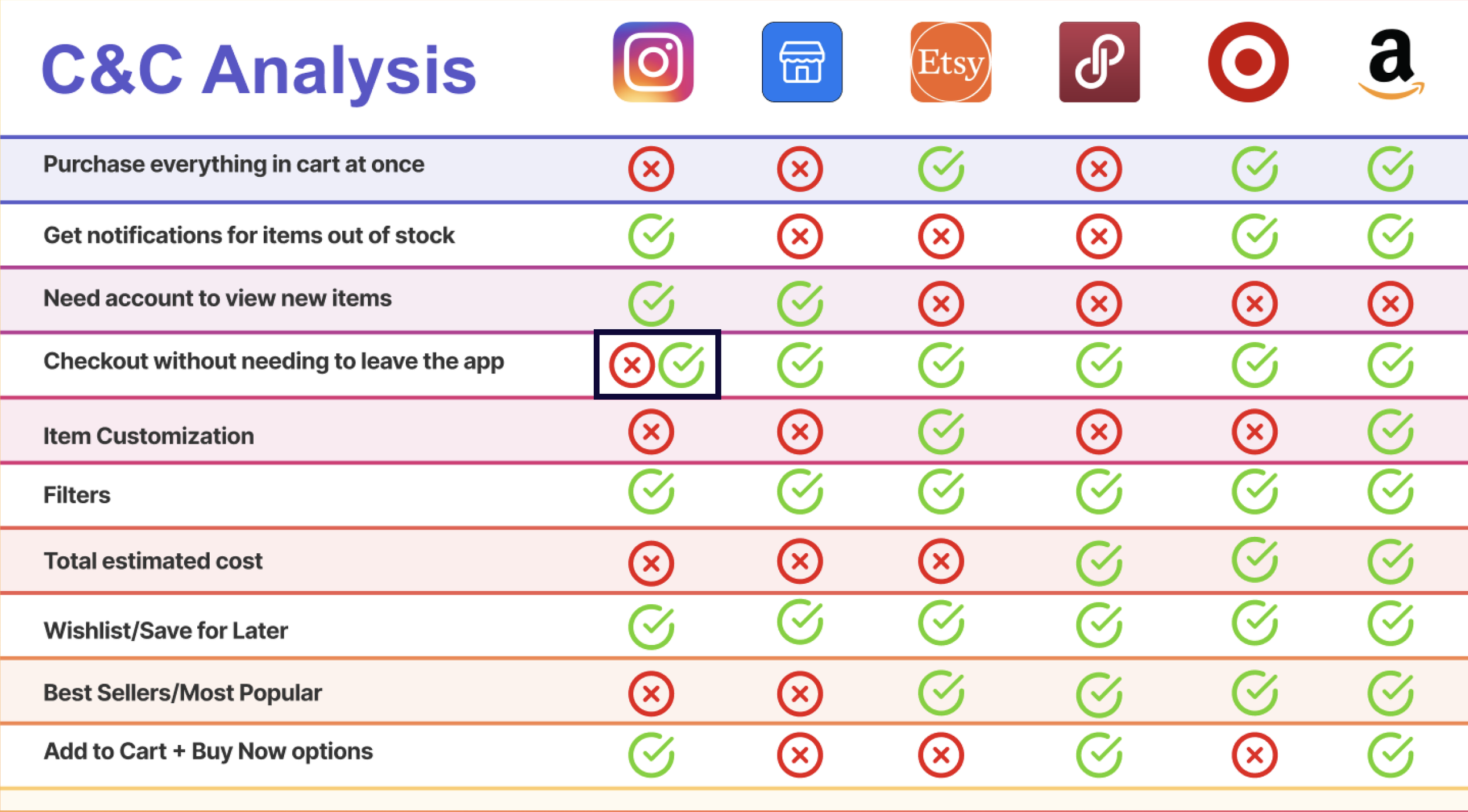
[Instagram is inconsistent in allowing checkout within the app.]
The most important takeaways following my research were:
An inability to purchase all products at once.
Instagram provides some important features such as filters, a wishlist and getting notifications for items out of stock
Amazon being the leading e-commerce market site could provide extra insight moving forward.

We also made an affinity map as a means of taking all of our qualitative data from our user interviews and categorizing them. This process helped us pinpoint what was important for the users before moving forward.
Empathizing with the User
With the data gathered from user interviews, we defined our persona, Jessica to better empathize with the main users. This would help us prioritize our goals by looking at Jessica’s needs.

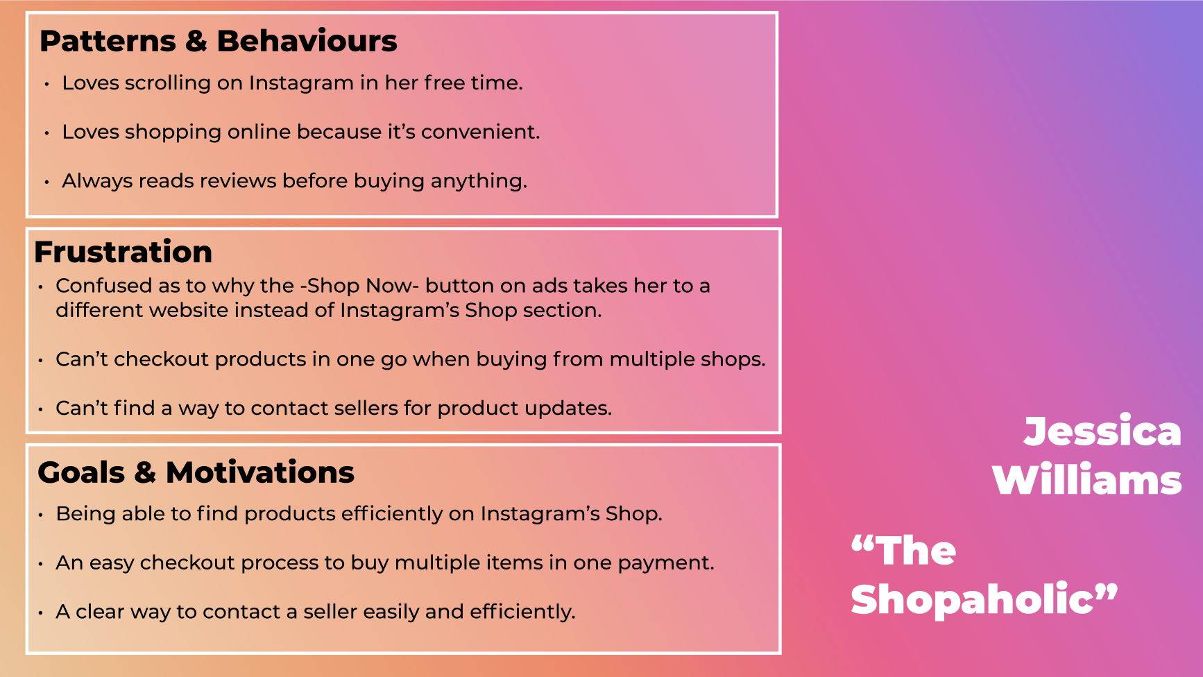
We depicted a user journey in order to visualize a scenario in which is Jessica is using Instagram and its shopping feature. This would reinforce our findings on the motivations behind Jessica’s interaction with the app as well as the frustrations leading to her not using Instagram for any purchases.
The Problem Statement
All of this information led us to our problem statement: Jessica rarely uses the Instagram Shop section because it is hard to navigate. She needs a way to seamlessly browse and purchase items easily so that she will be excited to splurge on new items.
Ideation
When it came to sketching out our ideas, we chose to use a design studio workshop. This method allowed us to explore as many ideas as possible, critique, and converge the best ideas all within a short amount of time. This collaborative effort allowed our team to come up with many ideas on mobile sketches, which made for an easy transition to our desktop sketches.
Our design studio workshop process was to take 5 minutes to sketch as many mobile screens, 2-3 minutes to critique, then take another 5 minutes to sketch with the best ideas. For our desktop screens, we focused on our individual screens when sketching.

Wireframes - Wireflow

We added the Cart icon to the top navigation of the Home Page.
We included a “Shop Now” button in navigation as a way to get to Shop Page.
3. We implemented the user stories idea in the Shop Page.
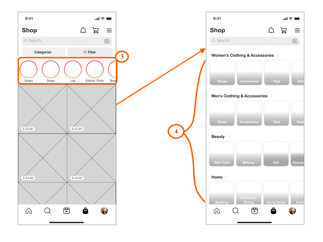
4. We changed the categories to image carousels from a dropdown.
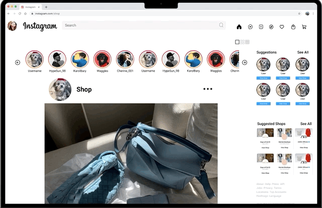
Hi-Fidelity Frames
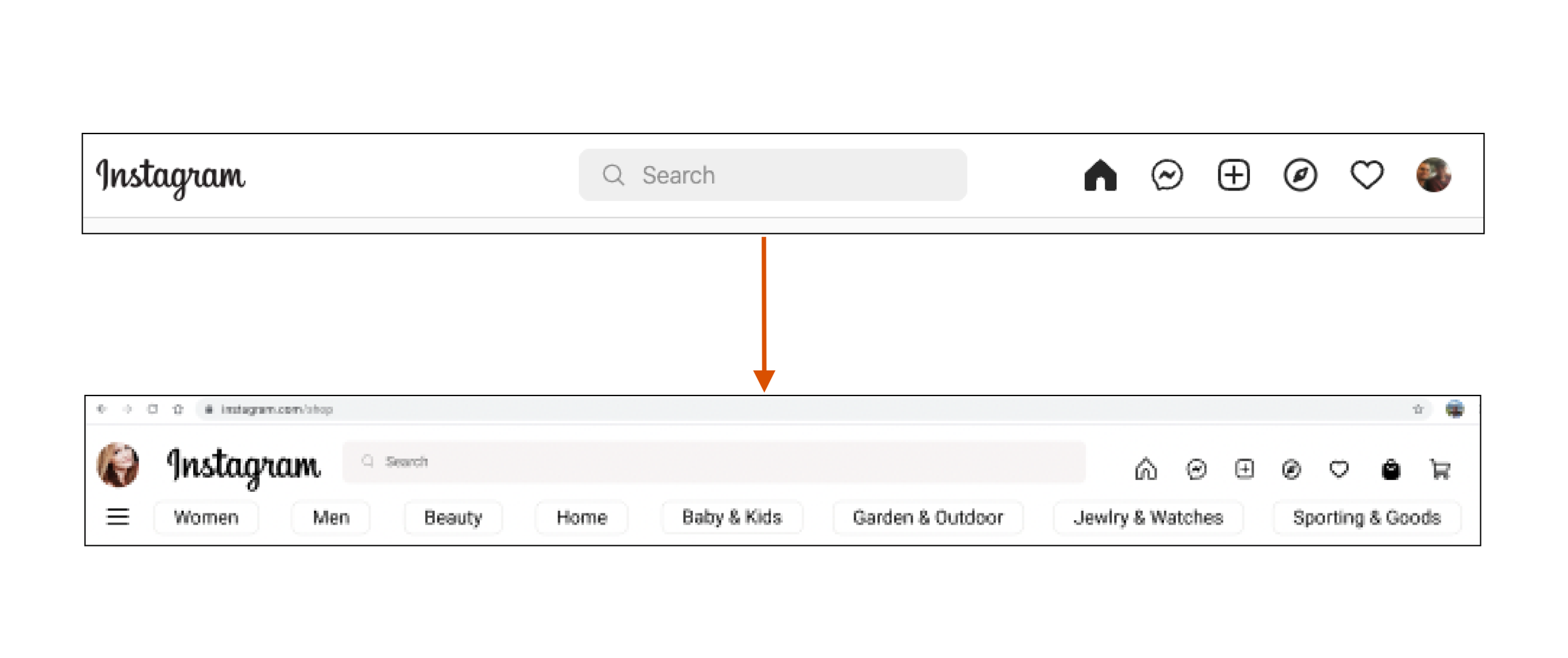
Because a desktop version of Instagram’s Shop did not exist, we looked to match the existing pages on mobile, but also find ways to have parts of the desktop version stand out. As mentioned earlier, inspiration from other e-commerce sites was taken.
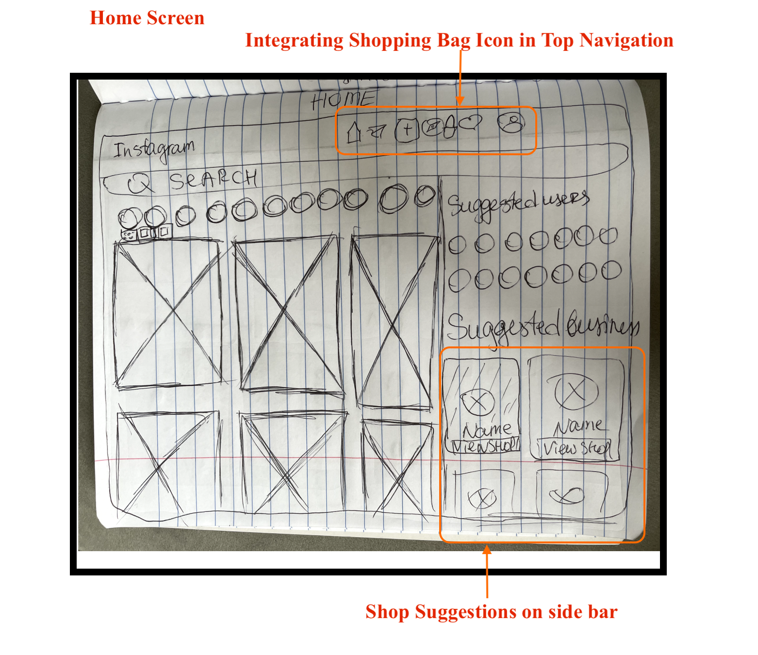
Adding the Shopping Bag and Cart icons within top navigation
Putting all Suggestions on the sidebar so User posts and Shop advertisements would be front and center.


Our Solution
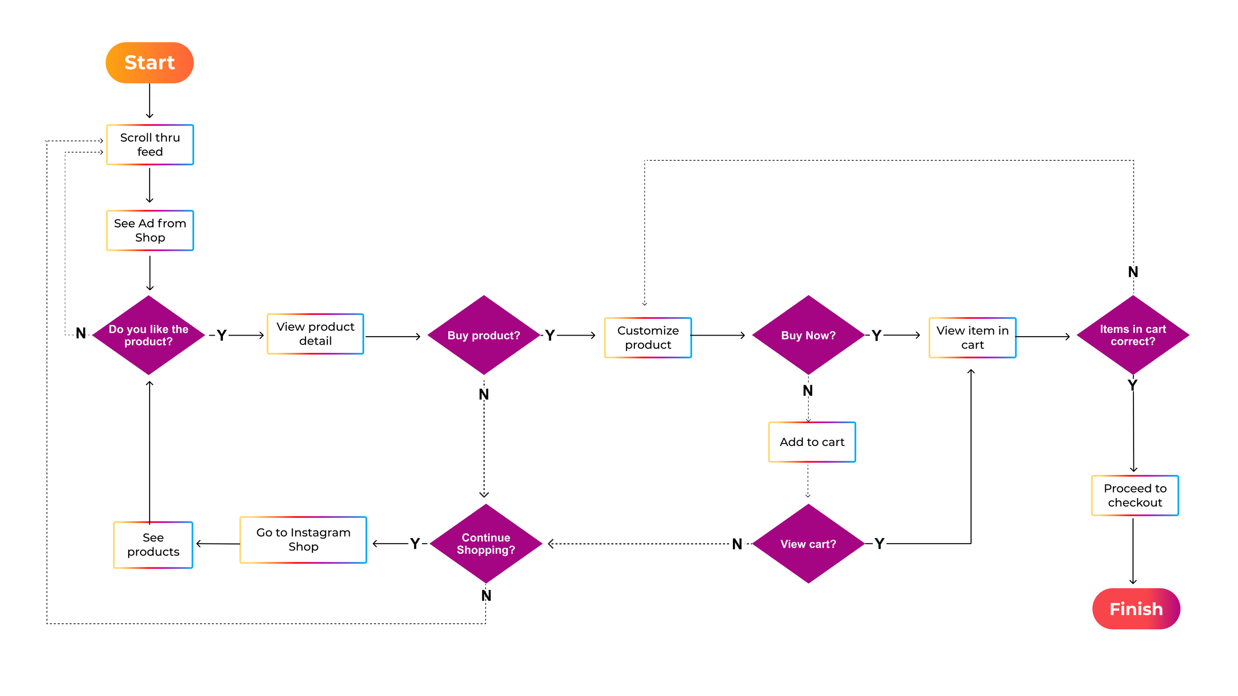
The User Flow that was agreed upon to show a more efficient step-by-step process of how Jessica would navigate through Instagram’s Shop.
Taking note from our user interviews, some visual adjustments we made were to the Search Bar and the Product page. Users mentioned the importance of communication with the Seller and being able to see reviews clearly.

Results and Next Steps
Following our finished Hi-Fidelity Prototype, we conducted another round of usability testing with 3 users. All 3 users noticed the Shopping Bag icon and were able to navigate both through the Shop Page and the Search Bar.

All 3 users noted the redundancy of having both a Shopping Bag and Shopping Cart icon side by side as well confusion with the Heart icon and its purpose.
Looking ahead, our team would want to interview users looking to sell products and expand their personal brand on Instagram’s Shop. We would also continue research on other social media apps and e-commerce sites to increase the appeal of the Shop.
What I Learned…
At the end of this project I learned:
The importance of communication with every step and having the roles of each person fully thought out before taking a step into the project.
To better budget time when setting goals for each day in order to follow the schedule set by the team and how to respond if there are any setbacks or issues.
How to improve the depth of my research and research synthesis when tasked with certain portions of user research .
Rapid sketching with a design studio workshop.