
Duration:
3 Weeks
Team:
Morgan Marzo
Mykel Jones-Carson
Shannon O’Gorman
Willie Cunningham
My Role:
Research Synthesis Lead and Design Lead
Methods:
Heuristic Evaluation
Competitive Analysis
User Interviews
Affinity Mapping
Persona Creation
Design Studio Sketching
Wireframing
Rapid Prototyping
Brand Overview
Usability Testing, A/B Testing
Tools:
Figma
Project Background
Our client, owner of Hiperion (a platform designed for growth/expansion phase startups to understand internal KPIs and deploy actionable plans) was looking to expand and provide an easily digestible analytics tool for new small businesses and startups. The reason behind this was that our client had worked with some clients who had difficulty understanding metrics and Google Analytics and needed an easy to use solution. The main priority was extensive user research leading to a data driven iteration that would be built off of the existing design library provided to us, which had no research behind it.
Our team made a Statement of Work for our client to outline a schedule and indicate what deliverables we would be sending to him. We also made sure to keep in mind how often we could contact our client to present our work and keep him updated of our progress.
Interviewing Our Client
We also interviewed our client to gather more information as well as ask any questions that could help. The main points we learned were:
3 main necessities: technical SEO (search engine optimization) help, defined KPIs, and sales.
Allowing clients to connect their Google Analytics information and synthesize it within the Hiperion dashboard.
A responsive desktop design.
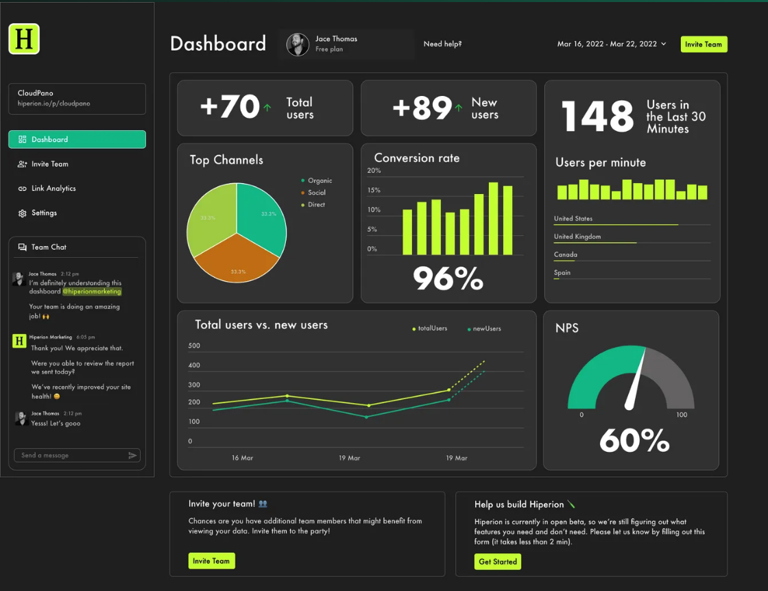
Client’s v.1 dashboard
Analyzing the Problem
Before proceeding, the first step was to take a look at the prototype we were provided and focus on what the team felt was good as well as what could be improved. We made a Heuristic Evaluation, which is a process to measure the usability of the user interface and note any issues based off recognized usability principles. We also conducted a Competitive Analysis, researching major competitors that also provide dashboard services for business analytics and metrics to assess their features.
An important takeaway from our starting research was that not many popular analytics dashboards included a chatting feature. We noticed some platforms had features that we wanted to consider for our design such as notifications of when certain metrics were met and an option to share a PDF of the dashboard. We also took consideration in hearing out our client’s ideas for any other features that could be added as well.
We then proceeded to create questions for user interviews as well as a survey to garner responses with those same questions. Our team also decided to try and get in some user testing on the design provided by our client if time permitted to hear user feedback and see what users would want when seeing business metrics.
A total of 8 users were interviewed along with our survey providing 3 responses. We realized that we did not do a good job of sending out the survey, but felt as though the interviews gave us ample feedback to work with. There were also 2 other user interviews that were done during our Ideation phase due to schedule conflicts so they were not included in our research synthesis.
We also compiled an affinity map to take all the data and categorize them to pinpoint what were most important to users. We took those
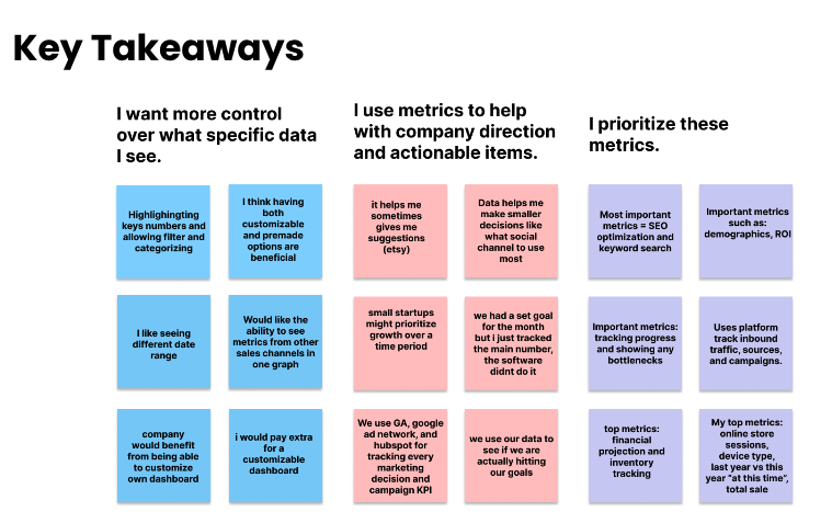
Several key takeaways from our affinity map
What does the User want and need?
Before mentioning our research findings, it is important to note that our client specified that the dashboard would be for small SaaS (Software as a service) business owners. We were unable to interview any SaaS business owners and the interview with our connected client was not a SaaS owner either so this was later shifted to a broader focus on all small business owners following our first progress update meeting with our client.
Following our research, our team moved into creating our persona, Zoe, to summarize all of our gathered data. From our persona, we learned that we needed to consider a means of describing metrics to a new business owner who not know any analytics to start along with a customizable dashboard that could be catered to specific user needs.

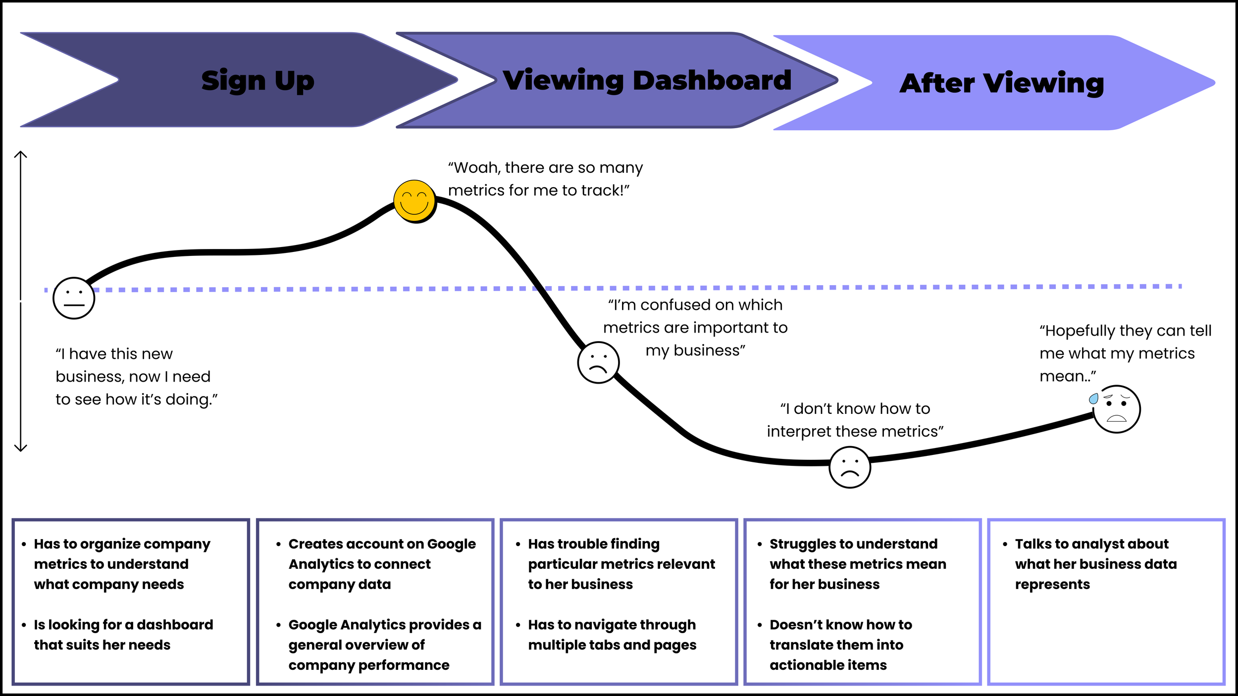
A user journey was also made to visualize how a new business owner who knows nothing about analytics might experience while using Google Analytics.
The Problem Statement
The problem statement we created is as follows:
Zoe needs a digestible way to view and prioritize key business data so she can understand progress to create actionable goals and incentivize employee performance.
We also considered some How Might We statements to help brainstorm any other ideas we might have missed earlier:
How might we make data digestible?
How might we allow for dashboard customization?
How might we simplify an individual’s metrics dashboard?
How might we consolidate user data from multiple platforms/data streams?
How might we help teams stay connected?
Ideation
In order to throw out as many ideas possible, our team chose to do a design studio workshop so that we could sketch ideas for the main dashboard, key features (research based or personal ideas), and a sidebar.
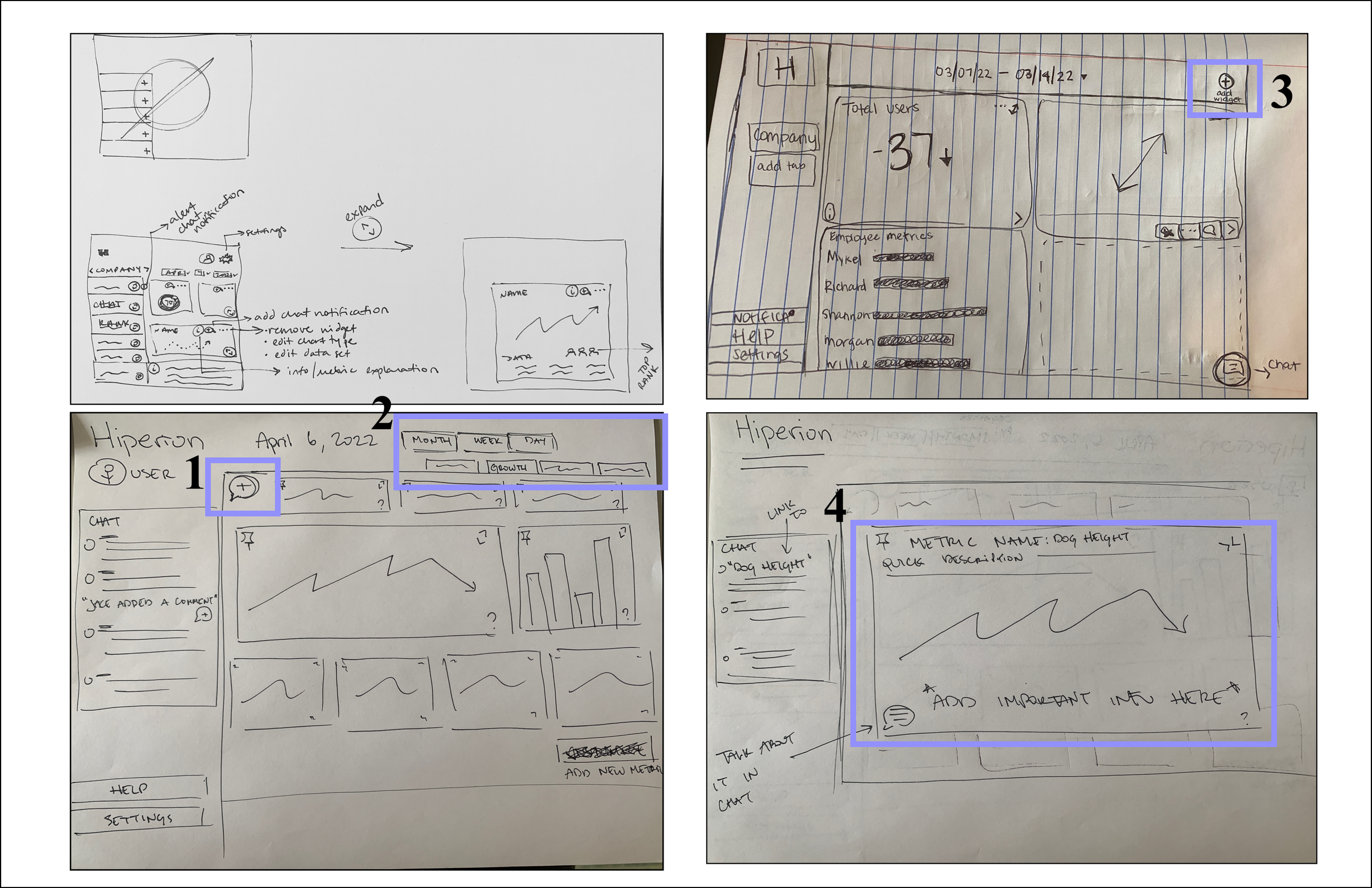
Dashboard Sketches
Comment feature for oneself or team members to make note on certain metrics.
Tabs to separate pages and possibly dates on dashboard.
An add widget button.
Expand metric feature to view more information and pin the metric.
Lo-Fidelity Wireframes:

Added a red mark that would signify notifications on a metric.
Hover state idea which would bring up different icons for a metric (expand, pin, add comment).
Idea to place Setting and Add team member icons on bottom right.

Different sidebar tabs
First Round of Usability Testing
Before transitioning to Mid-Fidelity wireframes, our team decided to do usability testing to compare different icons and the inclusion of certain features from ideation and user research.

We made note of user feedback for icons and we felt it would be important to
Next Steps
Explore different features for the dashboard and expand on the features that were added to our final prototype.
Continue to repeat the process of designing and user testing for more feedback for future iterations of the dashboard until its release.
What I Learned
With the end of this project I learned:
Being flexible in stepping up to take a lead role to help a group move forward if progress feels slow.
The need to understand that adjustments to a schedule will need to be made if progress halts or if the group doesn’t know how to proceed while waiting for interview/survey responses.
Valuable experience working with a client and the challenges that can come with it.
To be organized on Figma so that it’s easier to provide a duplicate copy of our deliverables for the client.